Thursday, May 12, 2011

Monday, March 14, 2011

How did you use media technologies in the construction, research, planning and evaluation stages? research, planning and evaluation stages?

Construction:
Ancillary Task

To create our magazine advert and digipac we had to use Photoshop. To begin with we had to use the still camera and take a variety of shots of our images. We were using a heart as our main image and took about 60 pictures of the heart in different situations. First we took a photo of it in our breakfast bowl with a green A3 piece of paper behind it as our imitation green screen so it would be easy to cut it out using the magic wand tool in photoshop. This worked well because it made it easy and neat when we cut around the image in photoshop as the green was a bold contrast against the white so the wand separated them easily. We then took a photo of the heart placed in the snow as we had heavy snow at the time and we poured the blood from the packet onto
the snow as though it has been chucked there and was very 'off place'. This worked for our genre as snow is supposed to be typically natural and beautiful however this broke that typical stereotype as a heart covered in blood is not what you would expect to see.

On photoshop we also used tools such as the outer glow around
our artists to not make them look so cut and jagged. Also we added effects on to the hand/heart to make it look darker and ore scratched rather than a pale natural hand (as shown to the right). We also used the paint bucket to create a block color background of black on our advert and on 2 of our panels of our CD cover as this is a typical color of the rock genre and is typically seen on other products. We also used the basic tools such as the eraser, text tool and selection tool. However we didn't use the fonts that were on photoshop as they were typical and boring. Instead we went onto Dafont.com and browsed through the hundreds of
fonts on there to find a perfect 'scratched' font for our digipac and advert. We ended up downloading one called 'Scorchflash', 'Spider fingers' and 'Bloody' to create a more interesting, bolder font which fitted our genre perfectly as shown below.


We also used dafont.com to find our logo. We typed in Rock on dafont.com and all these mini symbols came up instead of letters. We decided the mini one of the silhouette of a man on the drums was a perfect simple but effective logo to represent our band and genre.

How did you use media technologies in the construction, research, planning and evaluation stages?

Construction:
Music Video

When used the most media technologies in the construction of our music video. To begin with we had to shoot all our footage so we had things to edit. We began by hiring out 3 cameras, 3 tripods and the fig rig to take to Scream Studios in Croydon. We were filming the whole band shots so needed this many cameras because we needed a vast variety of shots, angles and levels as this was going to be a big part of our music video. We also needed an Ipod so we could download the track onto it and then connect it to a CD player to play the track out loud so the band could perform and lip synch to it. We also needed to film at Lewis' house and also needed 3 cameras and tripods.

We then had to upload our footage to the macs to begin to edit on Final Cut; we used the connection lead to connect the camera to the computer. To edit our footage we needed to use final cut and began to synch up our track and performer. We had trouble synching some of the footage up as the track we had used to perform too and the track we were using in Final Cut were slightly different so we decided that when we were deeper into editing we would have to cut to a different shot on some of the parts where the lip synching is slightly out. For example; when Sam was slightly out singing 'I feel insane', we cut to a shot of the drummer performing and this wasn't as obvious it was out of time.

We then had to film more footage; again using the cameras, tripods, and fig rig. This time we had to film our main performer, Sam, lip synching in front of the Green Screen, and then Tom playing the guitar solo as this was a 30 second section in our video. We had to set up the green screen with the media technician and had to make sure that the color and lighting of the screen was as even as possible so it was easy to edit and remove on Final Cut. When filming on the Green Screen we also used the HD slow motion camera to film Sam and Tom going 'mad' together. However because it was so slow and only filmed for 10 seconds at a time it looked out of place and didn't fit in with the fast pace of our track.


Sunday, March 13, 2011

How did you use media technologies in the construction, reaserch, planning and evaluation stages?

Planning:
When planning our music video and ancillary tasks we uploaded our material such as storyboards, drawings and talent release forms via the scanner to blogger. We also used media technologies such as the still camera to upload our location shots to show where we were going to be filming. (PICTURE OF CAMERA)

We also used the still camera to take photos of sam and upload them to the computer to do a practise CD Cover on photoshop to get a feel of the different tools and what they could do. To do this we had to put up a white sheet as the green screen (as we didn't have a green one yet). We then took a variety of different shots of Sam and Tom and then uploaded them to the macs to edit.
We also used the moving image camera to record Sam and Tom performing on the green screen to upload and have a practice on Final Cut. To film this we used the fig rig, and 2 other cameras on tripods to get the same shots but from different angles, to then upload and synch together. This gave us a taster of how to use final cut and have a basic trial on the elements final cut involved.

How did you use media technologies in the construction, reaserch, planning and evaluation stages?

When carrying out our reaserch we had to begin watching the 'TOP 40' music videos to get a clear idea of the conventions of a video from all types of genres. We watched these on You Tube and on the TV on the music channels where videos are shown daily. We then uploaded our anlysis and charts onto blogger as seperate posts and uploaded the YouTube video.

What have you learned from your audience feedback?

As i was near the end of finishing my ancillary tasks and music video; i asked 5 people of the right demographic (people interested in rock music) to come and view the music video and then the magazine advert and Cd cover. Without them knowing I had picked them specifically I asked them to 'Guess the genre' and 'Why you think it is that specific genre you have chosen'. They all answered individually 'Rock' and gave simple answers like 'Because the dark red and black colours' and 'the picture of the heart' and 'the band image fits that genre.' This showed that by following the basic conventions but still developing them in my own way it is still simple conventions that represent a genre.

I also asked them 'How effective is the music video and digipac linked together?'. The general overall answer was that the advert and cd cover linked perfectly together from the continuing picture of the heart and same Font/Colours. Also they said it was clear that the music video was from that genre and from showing the picture of the band on one of the Cd panels showed what the band looked like and then they were easily recognised when seen in the video.

I did this near the end of my product, rather than my finished product otherwise i woudn't of been able to change it if they said that it didn't fit.

What have you learned from your audience feedback?

After making the changes from my peer assessment we then had to hand in our second draft to be teacher assessed.

Even though they are not our target audience they found that some of the fonts were a bit cheesey of the blood dripping down so we changed it for a more scrtachy font as though it had been scratched in blood rather than a written in blood. Also we needed a band image of a whole band cropped properly and more neatly. Below is the feedback sheet we were given from the teacher.


What have you learned from your audience feedback?

After we finished the first draft of our music video and ancillary tasks we all had to individually go round and peer mark each others work in the class.

For my ancilliary task the main problem my peers picked up on as an 'EBI' was that it needed a few more comments and ratings because I only had one from 'Kerrang'. Secondly a few people commented that the band name 'Malice' needed to be bigger and bolder to make it clear that was the band name. However some strong points (What went well) of my ancilliary tasks was that it suited the genre very well and the post production on photoshop was used very well. Also it was commented that the whole idea was really effective and the colours worked well together.

For my music video the EBI's that were pointed out were it clearly wasn't finished and the green screen needed to be taken out. Also some of the shots were too long and dragged out to slowly for the pace of the music so we had to cut them more frequently. Secondly, we needed to change the white balance on some of the shots to make them more darker and 'gothic' because they were to bright and 'natural'. Lastly it was pointed out that out whole love scenario needed to be developed and seen more frequently as it has sections were you don't see it for a while so this needed to be developed. However some strong points people pointed out were the performance of the lipsynching and the singing was synced up perfectly. Also we has good shots and angles of the band; especially the main performer. Lastly we held the shots steady where they were supposed to be and we had the 'appropritate material shot'

How effective is the combination of your main product and ancillary text?

My magazine advert and Cd cover both combine well as one. They are both different and use different ideas however it is clear they are portraying the same band and album. They both use a heart as the main idea and image which bring the two different products together however they are used in different ways. On the magazine advert the heart is being squeezed by a hand with the blood dripping through the hands fingers, however, on the CD cover there is two hearts sitting in a white bowl with a spoon next to it. This is a literal image for the album name 'Blood For Breakfast'. We used this image as a person would traditionally use a bowl and spoon to eat your cereal in for breakfast, however, instead of cereal we used hearts as the cereal and blood as the milk. This then turned the whole idea to fit our genre and be grusome and sickly. We used the colours black and red throughout both tasks to bring them together. Also the fonts for the band name 'Malice' are the same on each task as we wanted to keep that the same so it was easy to spot and identify each one even though it was on a different product. Lastly we used a little logo of a silhouette of someone playing the drums on the products in small to combine the two pieced together as shown below.

In what ways does you media product use, develop or challenge forms and conventions of real media products?

In what ways does you media product use, develop or challenge forms and conventions of real media products?
My music video is a perfect fit into the 'Rock' genre. It is a very fast paced, quick cutting song. We followed the basic conventions of a music video; for example cutting on the beat and lip synching. However aswell as this we added certain effects like the 'earthquake' effect to make the video seem even faster and give it a stronger 'jolty' 'shakey' feel (as shown below). We also darkened the shots of the whole band sequence as they came out a pinky colour. We did this so the shots didn't seem so bright and typical of the 'pop' genre.

In what ways does your media product use, challenge or develop forms and conventions of real media products?

My Ancilliary task (Digipac and Advert) both represent my genre really well. The red and black used throughout clearly portrays the Rock genre and as an overall piece fits into the genre. We developed the colour red by using an actual image which is red rather than editing the colours to turn it red. We wanted to initially put it onto a black background but for the advert we decided to have a hand squeezing the heart to show the blood dripping down. We used a heart because a previous CD cover I had seen was a lady standing in the center of the frame holding her intestines so we developed this furthur and used a more grusome image of a 'heart'. Obviously we couldn't use a human heart so I brought some sheeps hearts and then added a basic effect onto it so you couldn't tell the difference.

Below is the Cd Cover in which i was inspired and then my own CD cover.


My Inspiration My Album Cover

In what ways does you media product use, develop or challenge forms and conventions of real media products?

From my research into music videos I found out that rock videos usually consist of these main factors;
-Playing instruments (guitar/drums)
-Have a main singer (quite screamy)
-Music is very loud/fast
-Colours are dark (black/red)
-Band members are very 'head banging'
-The band members have long hair which swoops across their face
-Main singer will come very close to the camera
-Fire/darkness is associated in the videos
-The narrative is still usually involving a 'love story' or affair


My music video follows all these conventions so it can clearly be identified as a Rock video. It uses very fast paced editing and cuts to fit the fast paced beat of the music video. We also use a lot of band shots of the band together and playing instruments to represent them as a band together.


In what ways does you media product use, develop or challenge forms and conventions of real media products?

When planning and researching into music videos, we also came across theories that people had created about what a music video should involve. We came across Goodwins' theory and his idea of illustration. We stuck to this whole idea of cutting on the beat and having literal images of what was being said. We also stuck to the literal idea of what the band should look like depending on their genre. So in our case we needed a band of 4 males all playing an instrument in a big room together. Below is an example of out fast cutting on the beat.


Monday, January 31, 2011

Magazine Adverts

The above advertisement is set in to two parts. The top half is for one album and the bottom is for a different. The top part shows the audience who's album it is and what it is called. The whole left half of the top is taken up by the band name 'The Academy Is...' This is in red lights, like ones at bars/studios. The left hand side is in white bold font writing and just gives basic information about the album name, dates, and songs. The whole top half colors are black, white and red which are the typical rock genre colors.

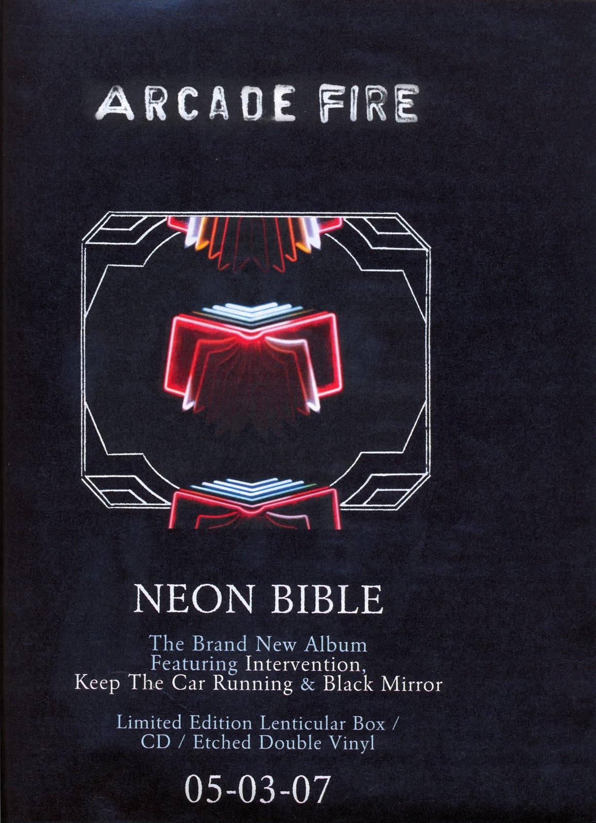
The above advertisement for Arcade Fire is one of the simplest advertisements i have seen but one of the most effective. It uses black and white coloring and then the main image uses 'neon' colors which reflects the album name 'Neon Bible'. These neon colors make the image stand out and the audiences eyes to firstly focus on that. The white, simple writing state what new songs are on the album which would be previous number one hits which would instantly draw your attention if you liked them songs. It also advertises the different ways in which you can download the album and what date it will be available to buy. The black background instantly makes the white and neon colors stand out and represent the genre of rock.
The above magazine advertisement for 'The Horrors' is a good example of an 'Indie-Rock' band advertisement. The whole black and white theme throughout gives a dark, eerie feeling. The centre image of the five band members sitting on a sofa with blank expressions give the overall emotions for the band which is quite serious and straight rather than 'happy clappy'. Also their costumes are black and white which is the typical colors for that genre. The simple, block white writing to advertise the band name and album release date is simple but effective. There is also 4 reviews bottom center from different magazines which gives the album a positive overview before anyone has even brought it. They are only in small simple font but because the advert is quite simple anyway people will read them.